

Awareness: Changing the Thinking of the Curve may Yield a Higher Return on Your Money.
Awareness: Changing the Thinking of the Curve may Yield a Higher Return on Your Money.
Yield Curve Inversions gets much of the Press and Attention - But its the Steepening, Flattening, & Real Yield part of the Curve that Deserves Your Attention.

In this article:
Monthly Story Count of Inversion, Flattening, and Steeping of the Yield Curve
Yield Curve Basics and Why Price Changes Matter
Bear & Bull Steepening - Bull & Bear Flattening & Factor Performance
NBER Recession Business Cycle, 3MO-10YR Curve, & S&P 500 Peak Relationship Analysis
Getting Real with the Curve
How much Forward Guidance of the Fed’s Dot Plot Influences the Pricing of the 2YR-10YR Curve
The Bull and Bear Case for a Soft Landing - Keeping an Eye on the Endgame
Feds Reaction Function
Reference Shelf
STAT SPOTLIGHT: In the 37 years before the pandemic, the 3mth-10yr part of the curve had not been inverted for a single day of any US recession.
For many risk asset participants, the yield curve has become more of a fashionable topic of late. Inversion of some curves prior to recessions has become a ever more viewpoint of widespread consensus thinking.
Curve Inversions have been commonly mentioned on behalf of the financial media at various times. Below is the monthly news story counts with a 10 year lookback.
“Inverted yield curve” up to 6,112 stories/month. “Yield curve inversion” up to 5,246/month. “Yield curve inverted” up to 2,279/month.
“Yield curve flattening” up to 752/month. “Yield curve steepening” up to 379/month.

The search results above show that the nominal curve steepening has the lowest story count. Even though during a non inflationary environment - its the steepening of the curve, not inversion - in which the media viewer may find to be of improved utility. Flattening reference here, here, and here.
There is a important distinction above. These all represent the yield curve in nominal terms which is often the central focus of attention. In an inflationary environment - the real yield curve - is part of the key to understanding the market and the current rally in risk assets.
In order to understand some of the dynamics of the stats in this post a understanding of some of the curve dynamics may be helpful.
Basics
What’s a yield curve?
It’s a representation of the difference in the compensation investors will receive for choosing to buy shorter-term versus longer-term debt. Most of the time, bond investors demand a higher return for the greater uncertainty that comes with locking away their money for longer periods of time. This results in a upward slope of the curve.
How many yield curves are there?
You can calculate a curve between any two bonds issued for a different length of time, or tenor. We track 120 different curves.

What changes in the curve shape matter most?
As shown above with the story counts, yield curve inversions can get a lot of media attention. A yield curve goes flat when the spread for longer-term bonds drops to zero — when, for example, the rate on 30-year bonds is no different from the rate on two-year notes. If the spread turns negative, the curve is considered inverted. The opposite occurs when longer-term rates rise relative to shorter-term ones — and the spread widens — this is called “steepening.”
Why do changes in the pricing matter?
The yield curve has historically reflected the market’s sense of prospects for the economy. Particularly inflation and what kind of policy the central bank may implement (whether it’s adding or removing stimulus, tightening, ect.). Normally, elevated inflation would lead to an upward sloping curve, as rising prices prompt investors to demand higher long-term returns to offset the loss of purchasing power in the payments they eventually receive. Yield curves can invert when investors expect that a recession resulting from US Federal Reserve policy will make inflation lower in the future, in relation to the near term. That connection has made an inverted yield curve a reliable indicator of impending economic downturns.
Bear Steepening

High yield across the curve (bear) led by the long-end (steepening).
Example: Fed has rates near zero and pushes them lower while flooding the system with liquidity as it did during the pandemic. The Fed would be able to stabilize the economy and markets, and that confidence would be reflected at the long-end (bull steepening). Long rates move higher in relation to short term rates when they are both rising. As shown lower in the post - the Fed’s communication influences prices - and with this situation, the Fed signaled that it plans to keep short-term rates anchored for years.

Bull Steepening

Lower yields across the curve (bull) led by the front-end (steepening).
Occurs because shorter-dated securities gain the most, pushing their yields down by more than those at the long end, widening the spread between the two. This could occur when the Fed’s slashing its short-term benchmark interest rates, as it did after the 2008 financial crisis - or even sooner, when traders anticipate the Fed’s move.

Bull Flattening

Lower yields across the curve (bull) led by the long-end (flattening).
This flattening occurs because longer-dated securities gain the most, pushing their yields lower by more than those at the short end. That compresses the spread between the two, making the curve flatter. This kind of move could happen when the Fed is holding rates steady but other forces are weighing on growth prospects, or tepid inflation readings encourage buying of longer-term Treasuries.
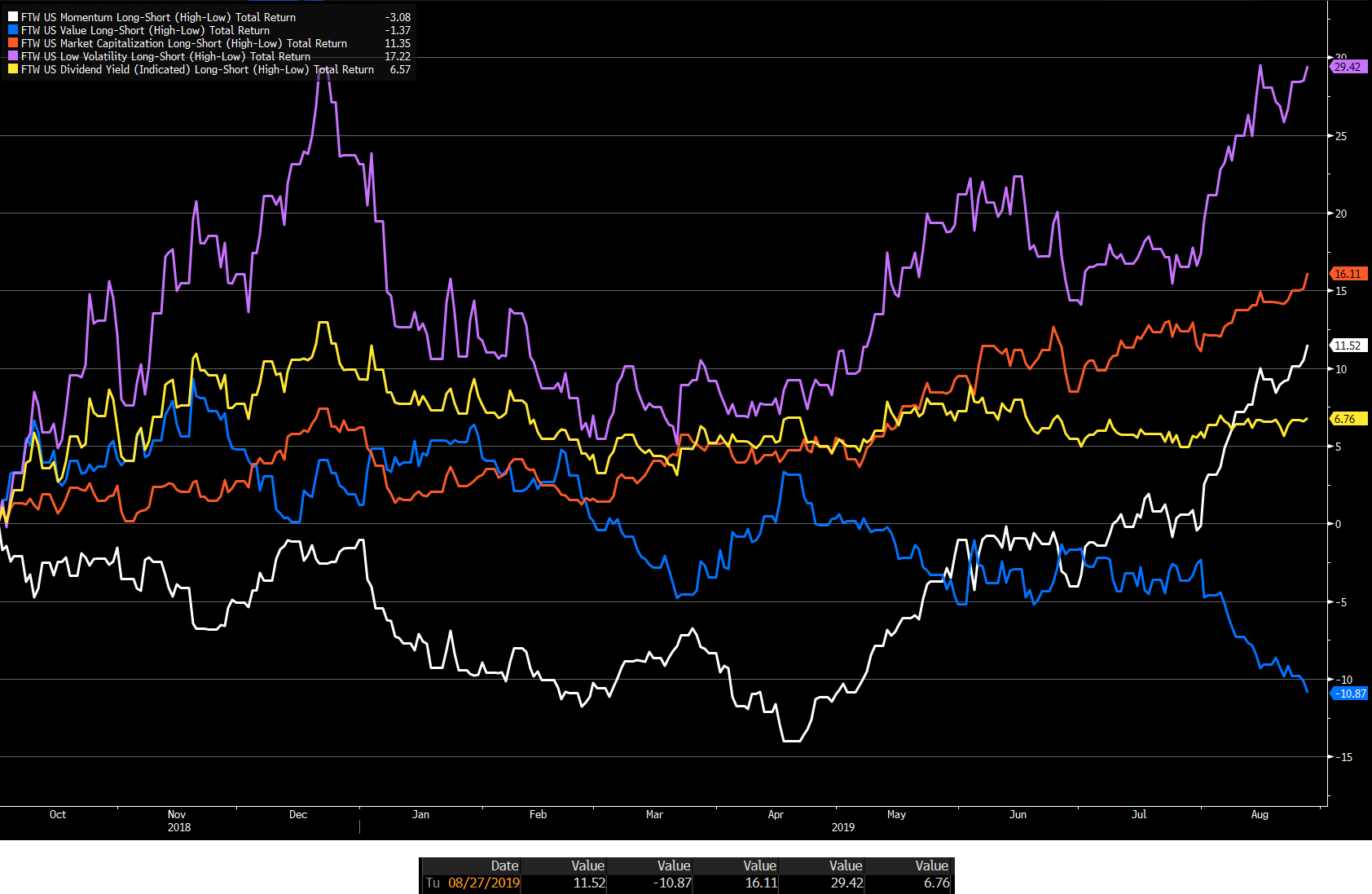
Bear Flattening
Higher yields across the curve (bear) led by the front-end (flattening).
This flattening occurs when shorter-dated securities see their prices weaken the most, increasing their yields at a faster pace than those at the long end. That compresses the spread between the two, flattening the curve overall. Moves like this might take place as the Fed tightens policy while inflation remains in check.

NBER Business Cycle, 3MO-10YR, & S&P 500 Peak Relationship
The lag from curve inversion to recession has been highly variable. History suggests that after curve inversion we shouldn’t assume a recession quite yet. The nominal curve inversion is neither a necessary nor a sufficient condition for a recession [see NBER footnote 1].
Even though the current curve remains inverted - this by itself - gives us limited visibility on exactly when the next recession will hit, how deep it will be, and what will happen to the pricing of risk assets.
(Footnote on NBER Recession start date announcement timing and qualifications)1

Key Takeaways
3s10s Inversion preceded every NBER Recession start month between 5 - 14 months [grey box].
Post ‘80, the duration of the business cycle length was longer than the curve inversion duration with exception to one case in ‘20 [green box].
Post ‘83, the curve steepend and uninverted prior to the NBER start in all four cases and pre ‘83 the curve stayed inverted into the start of the NBER cycle in all four cases [orange box].
The S&P 500 peaked at or before the start of the NBER cycle month in all cases but two - in which the S&P 500 peaked one month after the NBER start month for each of those two cases [purple box].
Pre ‘83, the S&P 500 peaked 3 - 23 months before the 3s10s uninversion and post ‘83 the S&P 500 peak was between 4 - 6 months after uninversion with the exception of ‘01 [blue box].
STAT SPOTLIGHT: In the last 95 years of data with the S&P 500 (was a index of 90 pre 1957) - the index peaked out before the last 10 of the 15 recessions with an average lead-time of three months. For the five cases it didn't peak before - the peak happened twice in the same month, twice after the recession started, and rallied through the recession during 1945. Since 1957, to not include the pandemic recession, the index peaked out before the recession in 7 of the 9 cases with a 5.3 month average lead-time.
After 1976, the stats below show with exception to 2000, there’s an opportunity cost of de risking as a result of 3s10s inversion.


Starting with ‘69, in all but one exception in 2020, SPX Index max drawdowns took >12 months2.

Excluding the recession in 1945, the average S&P 500 decline associated with recessions is 35% in the other previous 14 cases.
Nasdaq vs S&P 500. [CCMP Index - SPX Index (+ # shows Nasdaq outperformed S&P 500 and a - shows relative underperformance)].

Get Real
In an elevated-inflation environment it’s the real yield curve that can offer greater utility versus the nominal curve. The real curve gives us valuable insight into liquidity conditions and therefore the environment for stocks and other assets.
As an investor, the liquidity that may be of high value to pay attention to is excess liquidity (the difference between real money growth and economic growth).
Commercial banks - not just central banks - create liquidity when they issue loans. Commercial banks create new money when extending credit to the private sector. The economy and inflation soak it up, and any portion left over, is available to support risk assets.
This is why the real yield curve is important, as we find that its inverse leads excess liquidity. The chart below shows a flattening real yield curve often precedes rises in excess liquidity, and vice-versa, by about 3-6 months.

This at first seems to suggest liquidity increases as its price increases. But, factor into the role of the US dollar.
A guide to the ups and downs of the US currency is the real yield curve. The dollar is driven by the real return of foreign buyers of US yields. The flattening of the real yield curve last year signaled lower demand for dollars leading to its current downtrend.

A falling dollar has been one of the biggest drivers of rising excess liquidity this year. The rise in dollar denominated excess liquidity has been turbocharged by falling inflation, “freeing up” even more liquidity to support risk assets.

Over the medium term (12-36 months), its within historical experience that the curve has steepened after a peak in year-over-year inflation. During most cycles, the steepening began prior to peak inflation, but not always.
When the real yield curve began to flatten in October of ‘22, it was a signal that market conditions influenced by excess liquidity were soon about to change. This presented a tailwind for risk assets. The nominal yield curve told us that recession risk was rising, which is of little practical help to investors.
Falling inflation is driving the flattening in the real yield curve and, along with the weaker dollar, the rise in excess liquidity. A re-acceleration in price growth would likely damage this part of the sweet spot risk assets have enjoyed.
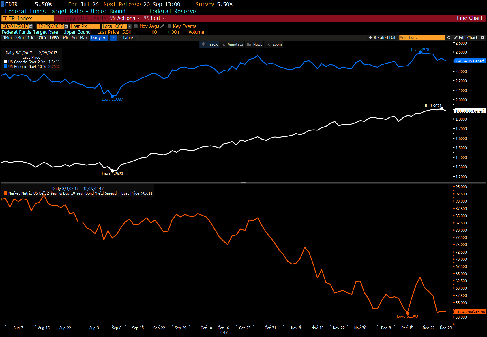
Connecting the Dots of the 2YR-10YR Yield Curve Pricing
Chart of 2s10s.

One influencing factor of the curve pricing is the guidance of the Fed’s dot plot. By adding the independent variable of the curve guidance of the Fed’s dot plot, the data shows the dot plot term is a significant contributor to the modeled inversion of the curve, adding nearly as much as the aggressive pace of tightening over the last year.


This suggests that in the absence3 of the dot plot, the curve would be a lot less inverted. 30% - 50% of the curve slope implied by the dot plot feeds through into the market setting of 2s-10s, and also influences the other curves. If for some reason the Fed views the slope of the curve to be not favorable for their objectives, one way to cause a different outcome, is to modify their forward guidance. In part, this is why public communication of current and previous FOMC members, can be valuable to pay attention to.
The Case for a Soft Landing - Keeping an Eye on the Endgame
Bear Case
The soft landing narrative has become entrenched in the markets. We’ve seen this before prior to past recession starts. For example, in October 2007 the Fed was suggesting the economy’s resilience with a overall soft-landing narrative. That’s when the S&P 500 topped out and the Great Recession started two months later. Will the most forecasted recession in history flip to being a highly unanticipated recession? Recently, one of the most reliable predictors of US recessions - the Senior Loan Officer Opinion Survey - was suggesting a likely downturn beginning toward the end of 2023. Tighter consumer credit points to softening in the labor market. Delinquencies are on the rise, which will likely increase towards year end. Credit card borrowers are using about 22% of their ever rising available credit, near the 2014-19 average and compares to 28% during the depths of the 2008-09 financial crisis.
Bookings Institution recently suggested that the aggressive consumption will soon come to a end as consumers run out of cash. This will be compound when student loan payments restart in October along with some states ending deferred tax liabilities. When consumers credit is maxed out, spending should further decrease. Other institutions such as JP Morgan, suggest household savings are projected to run out sometime in 2024.
Soft Landing? Not even the Fed believes it when looking at the SEP. But, the Fed has been wrong before. Among the policy making members of the FOMC, the median projection as of June was for the unemployment rate to rise to 4.5% next year, 1% higher than it is today. Every time the U3 unemployment rate rose by 0.5% from it’s recent 12 month low [Sahm Rule] since 1959, that occured with a recession.

Key Takeaways
S&P 500 made a new low after the Sahm Rule start date in 8 of 11 cases with an average of 118 days for all 11 of cases.
Of the 11 cases, the S&P 500 made five of the lows in the October month and three lows in March.
S&P 500 Peaked an average of 273 days prior to the U3 rising 50 bps within the most recent 12 months.
Average duration of the S&P 500 peak to trough was 391 days.
Average of 226 days of U3 increasing from it’s 12 month low to pass the Sahm threshold test.
S&P 500 low was an average of 251 days prior to the Peak U3 month.


Mass layoffs usually don’t occur until 1-2 quarters into a recession.
Can a unemployment rate of 3.5% actually be consistent with stable inflation, meaning that it doesn’t need to go higher? This may be the only likely path to a soft landing.
Past soft landings where the unemployment rate didn’t rise were 1965-66, 1984-85, 1993-94.
The non-accelerating inflation rate of unemployment, or NAIRU, is hard to know. Fed officials estimate its between 3.8% and 4.3% [these numbers match the Feds Central Tendency estimate for the “longer run” unemployment rate assumption - shown in their June ‘23 dot plot], down from 5.2% to 6.0% ten years earlier. Could it be lower?
Bull Case
There is evidence that the lags of monetary policy have shortened in relation to the historical norm. In part, this makes sense in a environment where the central bank communicates a lot of it’s plans in advance. The expectation that the Fed will soon be done, or is done, tightening has already eased financial conditions (stocks higher, credit spreads narrowed, dollar weakened).
The Fed, ECB, BoJ, SNB, BoC, BoE, and FX reserves of the PBoC central banks - only removed around 1/3rd of the $11 trillion in liquidity that they created in 2000-21. Real cost of money today is not prohibitive (Fed funds - Core CPI). With exception to 2020 - since 1960, the real cost of money exceeded 2% (the FOMC would hike the policy rate to bring it higher than inflation, pushing the yield curve to invert) prior to recession starts and has been as high as 10%, meaning the real cost of money was restrictive in real terms. Today, it’s barely positive as the FOMC has brought rates up to where it is nearly even with inflation. This may make the nominal yield curve inversion prior to recessions less valuable during this business cycle in relation to historical experience.
Inflation fell faster than expectations anticipated. This is not the base case, but if the Fed gets convinced that inflation gets on a sustainable path to 2% at some point next year, Powell has suggested it may be appropriate to to move to a more neutral policy stance. According to the recent Fed's SEP, neutral is 2.5%. [keep in mind, the Fed has a asymmetrical regime - when the Fed misses its inflation target on the low end it has attempted to push it up higher than it’s 2% mandate. When it misses the inflation target on the high end, its not trying to get it below the 2% target]
Fed’s large balance sheet cushions the interest rate risk of those assets, limiting the impact of rate hikes as the losses are on the Fed’s balance sheet.
Budget deficit % of GDP is near the level of the peak level of the GFC in 2009. This easy money fiscal policy helps offset rate hikes.

Using back of the envelope math, Federal Policy Impulse turned to easing. Fed funds + Change in US budget balance as % of GDP, YoY.

Bidens industrial and fiscal spending policies. $1.9 trillion American Rescue Plan, $550 billion Infrastructure Plan, over $50 billion Chips Act, and $437 billion Inflation Reduction Act.
Government transfers from Covid put the consumers balance sheet in better shape. About a third spent it, a third saved it, and a third paid down debt. The availability of consumers to spend because of their improved financial situation (that money circles around the economy after being spent, being transferred from one entities balance sheet to another, as it moves around) blunts rate hike effects. Time will tell how this plays out.
Chinese Politburo appears to have announced intentions to provide more stimulus. Much of the disinflation the US experienced was influenced by the much slower reopening of the Chinese economy where economic activity was lower.
Corporate sector financial balance is still in surplus. This condition has never been negative before all recessions since 1960, with exception to 2020. This may likely offset the nominal yield curve inversion cycle prior to recessions.


Feds Reaction Function
In the past half of century, the Fed has been slow to react to upturns in inflation and quick to respond following employment peaks.
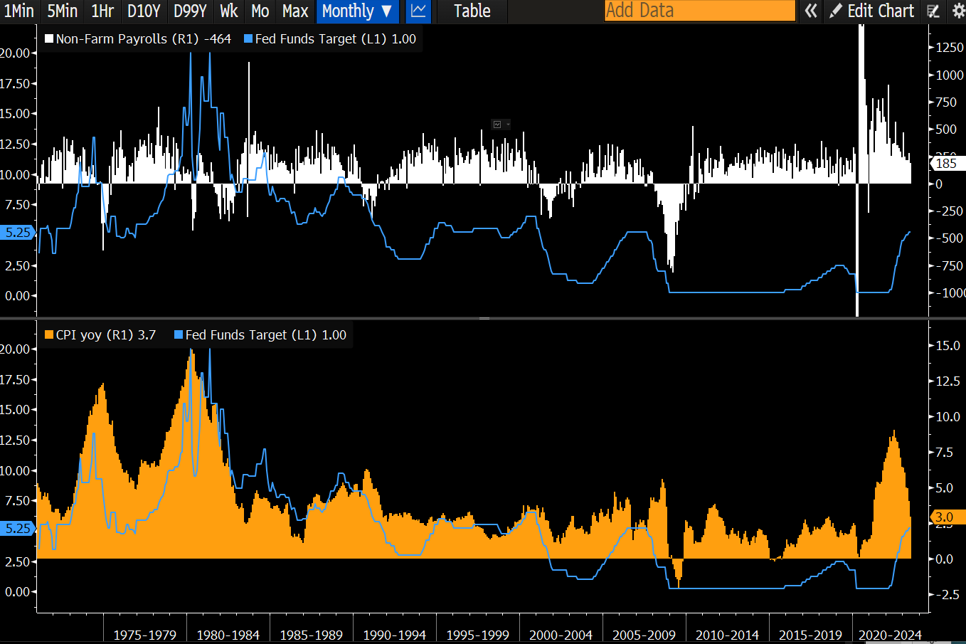
If the monetary-policy reaction function remains similar, any economic slowdown may need to include an expectation of job losses and lower inflation for the Fed to consider cutting rates.
Reference Shelf
Fed research paper on the merits of the near-term forward spread.
San Francisco Fed paper on the squeeze on the yield curve.
FAQ on the yield curve from the New York Fed.
Richmond Fed paper on if yield curves may now invert for reasons other than recession risks.
Recession start dates get officially confirmed by the NBER in hindsight, long after the recession officially started. This allows the NBER to account for all the potential data revisions that will come after the initial release. The NBER has never declared the start date of a recession within less than four months after it started. In normal cycles (the pandemic being a notable exception), whether we were in recession or not, was debated long after it was subsequently declared that one had begun by the NBER. One can look at what the NBER looks at to qualify recessions and review the qualifying metrics to the initial releases and revisions to assist in establishing a start date as well as leading indicators that suggest a qualifying data point may move in a particular direction.
When looking at the drawdowns of the S&P 500 stats earlier in this post, those are examples of drawdowns during a NBER recession after a 3s10s inversion date.
For those curious, the dot plot coefficient in the model with a constant is 0.31, and it’s 0.44 in the model without a constant. In other words, 30% to nearly 50% of the curve slope implied by the dot plot feeds through into the market setting of 2s-10s.